


U.S. Health Care Compared with Other Wealthy Countries
Numbers reveal both strengths and room for improvement
by Lawrence M. Eppard

The International Social Survey Programme (ISSP), in its most recent cross-national health care survey, found that 65% of Americans wanted either many changes to or a complete overhaul of their country’s health care system, compared with much smaller numbers in peer countries like Switzerland (27%) and the United Kingdom (38%).
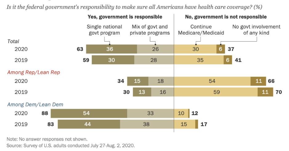
This does not necessarily mean that a majority of Americans support a European-style universal health care system. In a recent Pew Research Center survey, while 63% of Americans said it was the federal government’s responsibility to make sure that all citizens had health care coverage (28 million Americans were uninsured in 2020), only 36% supported a single national program (like the U.K.) while 26% supported a public/private mix (more akin to Germany, an approach that is very different from the U.K. system) (see Figure 1 below for survey results).
Figure 1. Americans’ Level of Support for Universal Health Care Coverage
Support for a universal health care system in the U.S. seems highly dependent upon how it would be structured. Many Americans generally dislike the idea of “socialized medicine,” worry that implementing universal health care would increase their taxes and/or be even more expensive than our current system, and do not wish to adopt a system that would limit choice or increase wait times.
In this article, I want to dive into some of the data on universal systems in other wealthy countries to see how they compare to the U.S. health care system on measures that many Americans care about.
These data come from the Organisation for Economic Co-operation and Development (OECD) (see here) as well as the Commonwealth Fund, a New York-based non-profit health care research and advocacy organization (see here and here).
The ten peer countries included in this analysis are Australia, Canada, France, Germany, the Netherlands, New Zealand, Norway, Sweden, Switzerland, and the United Kingdom. These countries were chosen for comparison because they all have above average GDP per capita, are OECD members, have universal health care coverage, and have available comparable data for this analysis.
Table 1 below displays the rankings for all eleven countries across the following indicators: safety, timeliness, efficiency, choice, and cost. See the endnotes at the end of this article for analysis methods.1
What follows is a discussion of each area of analysis.

Safety
The U.S. performs well on measures of safe care, coming in tied for second overall in this analysis with the U.K. An example of one of the measures included in the safety indicator is the rate of postoperative sepsis among patients who have had abdominal surgery. At 1%, the U.S. is topped by only New Zealand and Sweden (both less than 1%), while Australia (4%) is at the bottom of the list.
Many Americans would be hesitant to support health care reforms that required sacrifices in safety. These data suggest that this is a legitimate concern, but not one that forecloses the possibility of reform, as New Zealand (1st in safety) and the U.K. (tied for 2nd) offer universal care with safety comparable to the U.S.
Timeliness
Surveys show that Americans are perhaps most fearful about the impact that a switch to government-coordinated universal health care would have on their ability to receive timely medical care. The U.S. is in the middle of the pack on timeliness at 5th. In some of the countries in this analysis, citizens do indeed have to wait longer for care, with Sweden (10th) and Canada (11th) at the bottom of the list. But longer waits are not a guarantee, as four countries (the Netherlands, Germany, Switzerland, and France) rank higher than the U.S. on timeliness.
An example of a timeliness measure used in this indicator is whether people saw a doctor or nurse on the same or next day the last time they needed medical care. Around half (49%) of Americans had this experience—slightly below average compared with peer countries—with Germany (75%) and the Netherlands (66%) ranking highest. On another measure, 25% of Americans reported waiting two hours or more for care in the emergency room, which was middle of the pack, compared with only 9% in France but 50% in Canada.
One area where the U.S. performs particularly well in timeliness subcategories is for specialty and non-emergency care (3rd in this subcategory), but Germany (1st) and France (2nd) show that this can be accomplished in universal systems as well (subcategory data not included in Table 1 but can be accessed here and here).
Efficiency and Cost
The U.S. performs worst on efficiency among the countries in this analysis. This indicator consists of a variety of measures, including how much time doctors and patients spend on paperwork, dealing with coverage restrictions, and disputing bills. As an example, 19% of Americans reported spending a lot of time on paperwork or medical bill disputes, the highest in our analysis, while the U.K. performed the best at only 2%.
In terms of cost, the U.S. spends the most per-capita on health expenditures among OECD countries at $10,948 per year. Germans spend 60% of what Americans do per capita ($6,518), while citizens in the U.K. spend only 41% ($4,500). The average per-capita spending among the ten peer countries in this analysis is $5,597 per year, or about half (51%) of what the U.S. spends. For a more specific cost comparison, the average coronary bypass surgery in the U.S. cost around $78,000 in a recent analysis, compared with around $24,000 for the same surgery in the U.K. (or 31% of the cost of the U.S. surgery).
How do other countries offer quality health care at a fraction of the cost? Much of our public and political discourse on health spending focuses on administrative costs and the price of prescription drugs. While reductions in these areas would reduce the gap in spending between the U.S. and peer countries, it would be only a small change. Health spending data indicates that most of the additional dollars the U.S. spends on health care compared with peer nations goes to providers for inpatient and outpatient care (including payments to hospitals, clinics, and physicians for services and fees such as primary care, specialist visits, surgical care, and facility and professional fees). This is the primary driver of health spending disparities between the U.S. and peer countries.
In one analysis, for instance, comparable wealthy countries, on average, spent 48% less than what the U.S. spent on health care per capita. But if the U.S. had inpatient and outpatient costs that were similar to their peers, those other countries would only be spending 18% less. It is a huge difference.
Allowing the government to negotiate and then set prices—not unlike the American Medicare system—would go a long way toward bringing the costs of American health care in line with other wealthy countries without sacrificing quality.
It should be noted that universal health care can be accomplished in a variety of ways, it does not have to be through a system like the U.K. if that seems like too much government and too radical a change for Americans. Germany achieves universal coverage and much lower costs with private insurers and providers but firm government regulation—an arrangement that would feel somewhat familiar to Americans.
Choice
There does not seem to be a tidy way to quantify choice. In general, when compared with citizens in other wealthy countries, Americans often have more choice over their insurance carrier, but less choice over doctors or hospitals. In the U.S., health insurance companies often dictate which doctors we can see. In a number of other wealthy countries, patients do not face such restrictions and can choose from a wider array of doctors, hospitals, and labs.
Whether a health care system is deemed to have more or less choice is then really about what choice means to you. If choice for you means being free to choose your insurer, then the U.S. system offers a high level of freedom of choice. If choice means being able to go to any doctor that you choose, many Americans are quite limited in this regard compared with peer countries.
So Which One is the Best?
Which health care system is the “best” overall? This analysis cannot answer that question, as every system has both strengths and weaknesses.
The U.S. system, for example, performs well on safety but is at the bottom of the list on cost and efficiency. Canada also performs well on safety (4th) yet their citizens wait the longest for care (11th). It is the same story across the board: there are areas where every country, including the U.S., performs well, and then there are areas where they could perform better.
There is no magical health care system that does everything well. The question is not whether systems have to make compromises and prioritize some things over others, but which priorities are most important to citizens in each country and which compromises they are willing to live with.
So is there anything to be learned from these other countries? Absolutely. The weight of the evidence seems to suggest it is possible to improve the cost and universality2 of the American health care system without making major sacrifices in overall quality. The U.S. does not have to adopt any one of these countries’ health care approaches wholesale in order to learn from specific aspects of their systems that work well.
A special thank you to Cynthia Cox from the Kaiser Family Foundation for her valuable feedback on previous drafts of this article.
Safety indicator based on countries’ average ranking across safe care indicators 21-25 in Appendix 5B of the 2021 Commonwealth Fund report. Timeliness indicator is based on countries’ average ranking across timeliness indicators 6-9 in the 2021 Commonwealth Fund report (Appendix 4) and timeliness indicators 5-9 in the 2017 Commonwealth Fund report (Appendix 3). Two data sets were used to construct the timeliness indicator because indicators 5-9 in the 2017 report, which are important for this analysis, were not included in the 2021 report. Efficiency indicator is based on countries’ average ranking across administrative efficiency indicators 46-50 in Appendix 6 of the 2021 Commonwealth Fund report. Choice was a difficult indicator to quantify, so please refer to the discussion in the article. Cost indicator is from Figure 7.4 from OECD data here.
All peer countries in this analysis have universal coverage, while 28 million Americans were uninsured in 2020.