

The Tricky Task of Comparing Poverty Rates Around the World
New study from Connors Institute researchers
A new study from researchers at the Connors Institute questions the common assertion from American social scientists that the U.S. poverty rate is high among wealthy countries. Key findings from the study below.
This new research comes from Lawrence Eppard (Connors Director), David Boatwright (Connors research fellow), and Thomas Hatvany (Connors Institute Democracy Lab Supervisor) and will be published in the Journal of Working-Class Studies later this month.
Is the poverty rate in the United States high, low, or average compared with other wealthy countries? This is a seemingly straightforward question, but the answer is somewhat tricky.
It is common for social scientists to use what is called a “relative poverty measure” when comparing two or more countries’ poverty rates. Depending upon which relative measure one chooses to use, people are considered poor if they live in a household that earns less than 50% or 60% of their country’s median national income (after taxes and government transfers).
Using a relative measure to compare countries, the U.S. has one of the highest poverty rates not only among Organisation for Economic Co-operation and Development (OECD) countries—a group containing some of the world’s wealthiest countries—but among all countries in the world (at least among those 91 countries for which we have data in this study).
As you can see in Table 1 below, under the 50% relative threshold the U.S. ranks 79th out of 91 countries (with 91 being the highest-poverty country). Under this measure, the U.S. has more poverty than underdeveloped countries like Burkina Faso, Democratic Republic of Congo, Mali, Niger, and Sierra Leone.
The country with the lowest poverty rate in Table 1 is Pakistan (3.6%), followed by Kyrgyzstan (3.7%), Kazakhstan (3.8%), Moldova (3.9%), and Czechia (4.9%).
To many people, this probably seems. . . a bit off. For example, the richest 10% have about $3.31 to spend a day in the Democratic Republic of Congo and $8.07 in Pakistan—compared with $22.93/day for the poorest 10% in the U.S. (see Figure 8 below). In Pakistan, 94.5% of people lived on $10/day or less in 2018, compared with only 2.5% in the U.S. (see Figure 9 below).
Considering this, how could Pakistan not only have significantly less poverty than the U.S., but the lowest poverty rate in the world? How is it possible that countries like the Democratic Republic of Congo (99% living on $10/day or less) outperform the U.S. (2.5%) when it comes to poverty (see Figure 9)?
If different poverty measures lead to dramatically different cross-national poverty comparisons, which one is really measuring poverty?
In a previous article that we published in the Journal of Working-Class Studies (JWCS), we used an absolute measure to compare countries, relying on data from the Luxembourg Income Study (LIS). Absolute measures of poverty are calculated based on the assumption that, below the chosen income threshold, people cannot afford their basic needs. The absolute measure we used was designed to mirror, as closely as possible, the official poverty line published each year by the U.S. Census Bureau (see Table 2 below for the most recent Census poverty thresholds for different family sizes).
Unlike analyses which use a relative measure and find that the U.S. has one of the highest poverty rates among OECD countries, our absolute measure in that earlier JWCS article suggested that poverty in the U.S. was rather average for a wealthy country. We were limited in how satisfied we could be with that earlier analysis—including data issues that lead to imprecise estimates and a limited number of countries with recent data—so we decided to pursue this question further with different data in this study.


FIG 8. Consumption Per Day, Poorest Americans versus Richest Citizens in Select Countries.

FIG 9. Distribution of Population Between Different Income Levels for COD, PAK, & USA.


FIG 11. Importance of Purchasing Power Parity (PPP) Adjustments.

In this study, we use an absolute poverty measure from the World Bank to compare poverty rates cross-nationally. Our absolute measure is the percentage of the population living in households with income/consumption per person below $30 per day (after taxes and benefits wherever possible). All incomes are converted into USD using Purchasing Power Parity (PPP) adjustments (see Figure 11 above).
The reason we chose the $30/day threshold (rather than any of the other thresholds available, such as $1.00, $2.15, $3.65, $3.85, $10.00, $20.00, or $40.00), is that $30/day was the closest to approximating the U.S. Census Bureau’s official poverty line. The $20.00/day line resulted in a poverty rate that was far too low for the U.S., while $40.00/day was far too high.
As for the year we chose to analyze, 2018, we (a) wanted to use the most recent year in the database that had a large number of countries reporting data and (b) wanted to avoid any years where the COVID pandemic created odd distortions in the data. With these considerations in mind, we settled on 2018—a non-pandemic year where 91 countries reported data.
Like our analysis in our earlier 2022 JWCS article, the U.S. poverty rate was not high compared with most other OECD countries when using the World Bank’s $30/day absolute threshold. In fact, the poverty rate for the U.S. (17.5%) was below both the average and median rates for OECD countries (36.5% and 26.7%, respectively).
The average and median rates for just the wealthiest 30 OECD countries were 27.1% and 18.5%, respectively, placing the U.S. right in the middle of the pack (15th out of 30). Comparing the U.S. to just the wealthiest 30 OECD countries is illustrative, as this excludes countries with much lower GDP per capita—countries like Costa Rica, Colombia, and Mexico.
Compared with all countries reporting data, the U.S. performed very well, coming in at the 15th lowest poverty rate among 91 countries (see Table 1 above).
To recap:
Under the relative measure,1 poverty in the U.S. was:
High compared with all countries (79th out of 91 countries).
High among OECD countries (34th out of 37).2
High among just the 30 wealthiest OECD countries (29th out of 30).
Under the absolute measure,3 poverty in the U.S. was:
Low compared with all countries (15th out of 91).
Below average among OECD countries (15th out of 37).
Average among just the 30 wealthiest OECD countries (15th out of 30).
As you can see, these two measures tell two very different stories about U.S. poverty in cross-national context. So which one is actually measuring poverty?
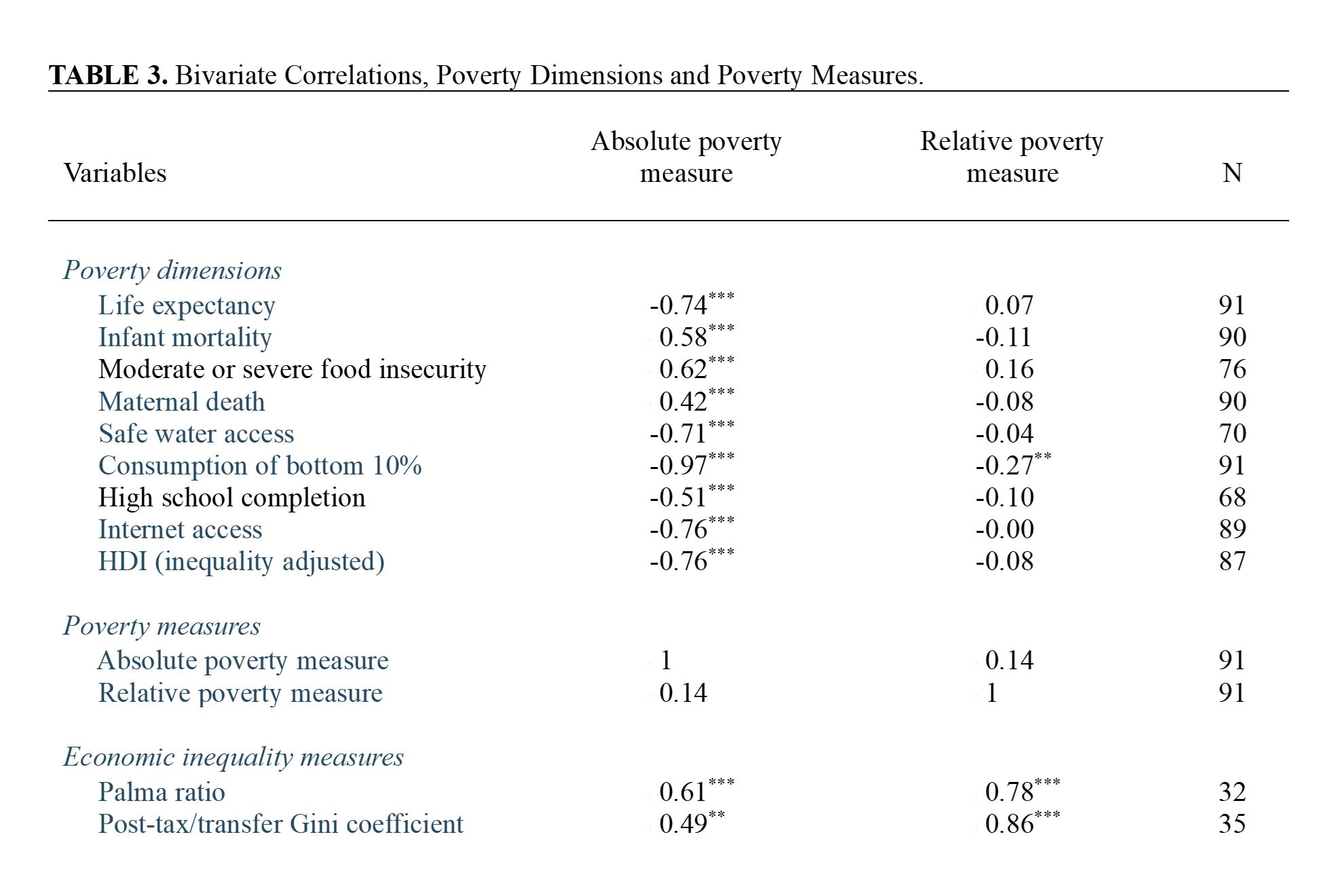
To try to answer this question, we first calculated the Pearson bivariate correlation between the relative poverty measure (less than 50% of median national income) and our absolute poverty measure (less than $30/day in USD to spend). As you can see in Table 3 below, their association is not statistically significant. The r-value was 0.14, with a p-value much higher than 0.05 (p = 0.198).
The relationship between absolute poverty and relative poverty was also tested using Kendall’s tau because of a violation of normality. The results indicated that there is no relationship between absolute poverty and relative poverty.
To further demonstrate that no relationship between absolute poverty and relative poverty is present in the data, a Bayesian Kendall’s tau was conducted between the variables. The results demonstrated moderate evidence in support of the null hypothesis that absolute poverty and relative poverty were not related.
Absolute poverty is not normally distributed given a very large ceiling effect. Kendall’s tau, which is robust to any violation of normality, shows the same pattern of results as our Pearson correlations.
If absolute poverty and relative poverty are not correlated, and thus they are not measuring the same phenomena, this begs the question: which one is measuring poverty?
To determine this, we first identified several dimensions of poverty beyond income where a poor person would struggle. Somebody who is poor, for instance, is not just struggling financially, but also when it comes to things like their health and access to food. Any poverty measure should be correlated with these measures, as they should rise and fall together.
So while we included the amount of money available to the poor (bottom 10% consumption), we also selected the following non-income poverty dimensions: food insecurity, high school completion, inequality-adjusted HDI (IHDI), infant mortality, internet access, life expectancy, maternal death, and safe water access:
“Bottom 10% consumption” refers to the level of after-tax income or consumption per day per capita in the bottom 10% of the population in a given country (expressed in USD). These data come from the World Bank.
“Food insecurity” refers to the percentage of the population in a given country that is either moderately (the inability to regularly eat a healthy, nutritious diet) or severely (an insufficient quantity of food) food insecure. Food insecurity is defined by the Food Insecurity Experience Scale (FIES). These data come from the United Nations.
“High school completion” refers to the percentage of people who have completed upper secondary education in a given country. Upper secondary education refers to education that typically happens between ages 15 and 18 and prepares students for tertiary education and/or the workforce. These data come from the United Nations.
“Inequality-adjusted HDI” (IHDI) data come from the United Nations. “HDI” refers to the Human Development Index, which examines three dimensions of human development in a population: living a long and healthy life, educational attainment, and having enough income to maintain a decent standard of living. The IHDI measure accounts for inequalities in these dimensions across a given population. The higher the value (values range between 0 and 1), the more evenly these dimensions of human development are spread across a given country’s population. A country’s score on the IHDI would be the same as its HDI score if there is no inequality in its population. The greater the level of inequality, the lower the IHDI relative to the HDI.
“Infant mortality” refers to the estimated percentage of newborns in a given country who die before they reach one year of age. These data come from the United Nations.
“Internet access” refers to the percentage of the population in a given country who used the internet at some point in the last three months. These data come from the International Telecommunication Union via the World Bank.
“Life expectancy” refers to the average number of years a newborn is expected to live in a given country, assuming that the mortality rates that were present at the time of their birth stayed constant throughout their life. These data come from a variety of sources compiled by economist Max Roser’s team at OWD.
“Maternal death” refers to the estimated number of women who die due to childbirth in a given country per 100,000 live births. These data come from a variety of sources compiled by OWD.
“Safe water access” refers to the percentage of the population that has an improved water source located at home that is available when needed and is free from contamination. These data come from the World Health Organization (WHO) and the United Nations.
The values of these nine poverty dimensions, we believe, should rise and fall in relation to the degree to which a valid poverty measure rises and falls.
A good metaphor would be a thermometer—if the air temperature rises a given number of degrees, the reading on a thermometer should rise the same number of degrees. Likewise, if the number of people suffering from hunger increases in a given country during a given period of time, one would expect a valid poverty measure to increase in a corresponding fashion—otherwise, it is not clear that it is measuring poverty.
Table 3 (above) and Figures 13 & 14 (below) display the Pearson correlations between our absolute and relative poverty measures and the nine poverty dimensions.
All nine of the poverty dimensions had statistically significant (p < 0.05) correlations below the 0.001 level with our absolute poverty measure. Eight out of nine were strongly correlated (r > 0.50) and one (maternal death, r = 0.42***) was moderately correlated (r-value between 0.30 and 0.49).
Eight out of nine poverty dimensions did not have statistically significant correlations (p > 0.05) with our relative poverty measure. The one that did was bottom 10% consumption, with a weak correlation (r-value between 0.10 and 0.29) of -0.27**. Bottom 10% consumption was much more strongly correlated with our absolute poverty measure (r-value of -0.97***).
The results in Table 3 are quite striking. All of the poverty dimensions are much more strongly associated with our absolute poverty measure. This supports the notion that, if absolute and relative poverty are measuring different things, whatever our absolute variable is measuring is much closer to poverty than what the relative variable is measuring.
We then calculated where each country ranked on the nine poverty dimensions and averaged each country’s rank across all nine dimensions. We also calculated each country’s rank on both poverty measures. Then, we calculated Pearson correlations between countries’ average poverty dimension rankings and their relative and absolute poverty rankings. As you can see in Table 4 and Figure 15 below, the correlation between poverty dimension ranking and relative poverty ranking was not statistically significant (p > 0.05). The correlation between poverty dimension ranking and absolute poverty ranking, however, was incredibly strong (0.92***).
In a regression model predicting poverty dimension ranking, absolute poverty ranking (0.930***) had a much larger standardized coefficient than relative poverty ranking (0.179***) (model r-square 0.886***).
We then calculated a cross-tabulation table (Table 5 below) demonstrating the average values across the nine poverty dimensions in high-poverty and low-poverty countries based on both our absolute and relative measures. Whichever poverty measure is more accurately measuring poverty should have worse averages across these dimensions.
And in fact, all of these dimensions were worse under the absolute poverty measure than under the relative poverty measure.
Life expectancy, for instance, was only 62.3 years in the poorest countries in absolute terms, but 75.5 in the poorest countries in relative terms. The same pattern held for infant mortality (5.0 deaths per 100 live births under absolute poverty versus 1.2 deaths under relative poverty), food insecurity (44.3% versus 23.5%), maternal death (431.8 deaths per 100k versus 52.9), safe water access (27.0% versus 78.2%), bottom 10% consumption ($1.88/day versus $5.95/day), high school completion (28.1% versus 71.0%), internet access (24.5% versus 65.3%), and IHDI (0.35 versus 0.64).
FIG 13. Bivariate Correlation Between Bottom 10% Consumption and Both Poverty Measures.
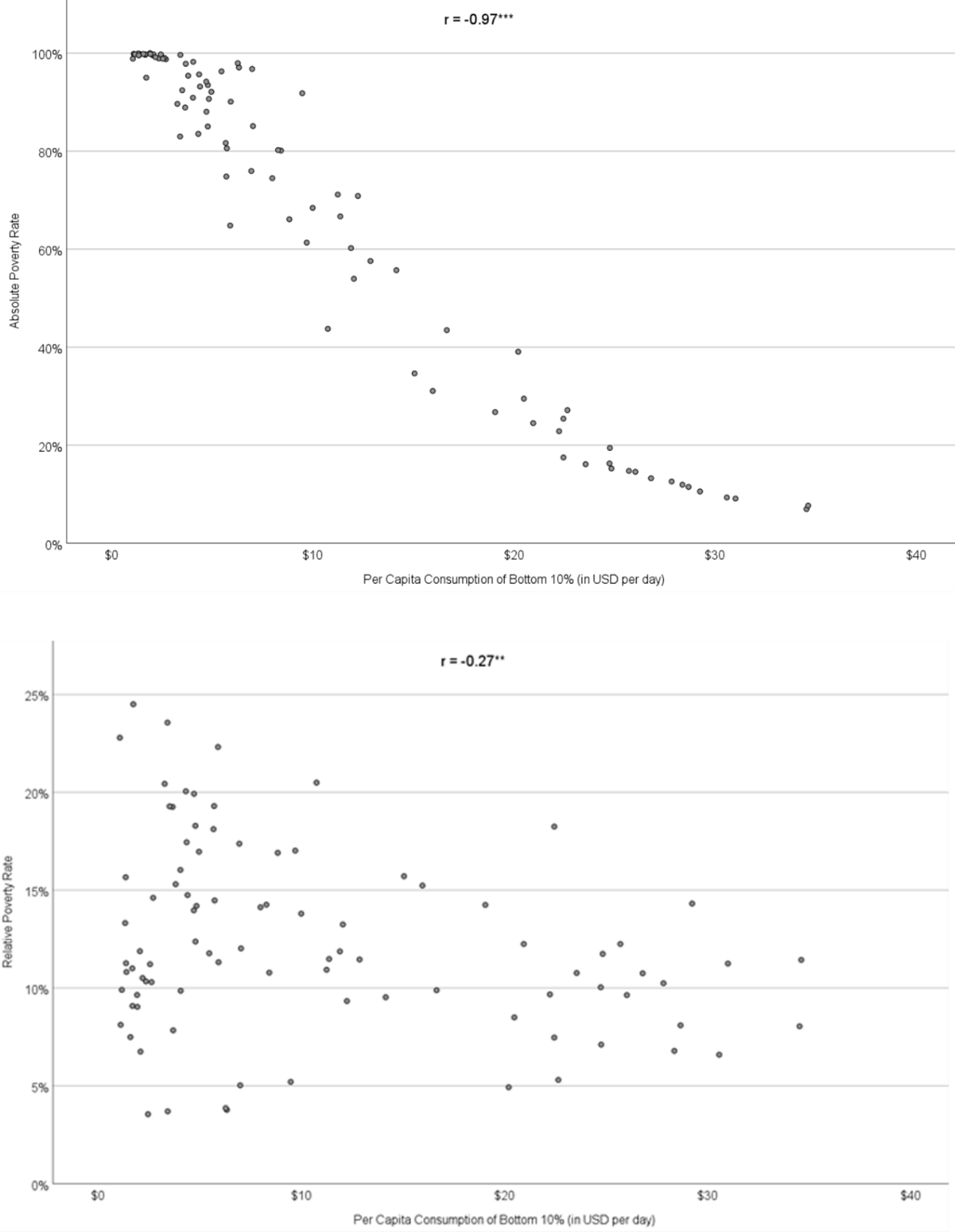
FIG 14. Bivariate Correlation Between IHDI and Both Poverty Measures.

FIG 15. Correlations Between Rankings on Poverty Dimensions and Poverty Measures.


The relationship holds at the top as well—there is less suffering in low absolute poverty countries than in low relative poverty countries.
In low absolute poverty countries, for instance, the average life expectancy is 7.3 years longer than in low relative poverty countries. The same pattern holds for infant mortality (0.4 deaths per 100 versus 1.7), food insecurity (5.7% versus 17.4%), maternal death (6.8 deaths per 100k versus 77.5), safe water access (99.0% versus 84.0%), bottom 10% consumption ($27.06/day versus $14.21/day), high school completion (84.8% versus 76.3%), internet access (90.5% versus 68.2%), and IHDI (0.86 versus 0.69).
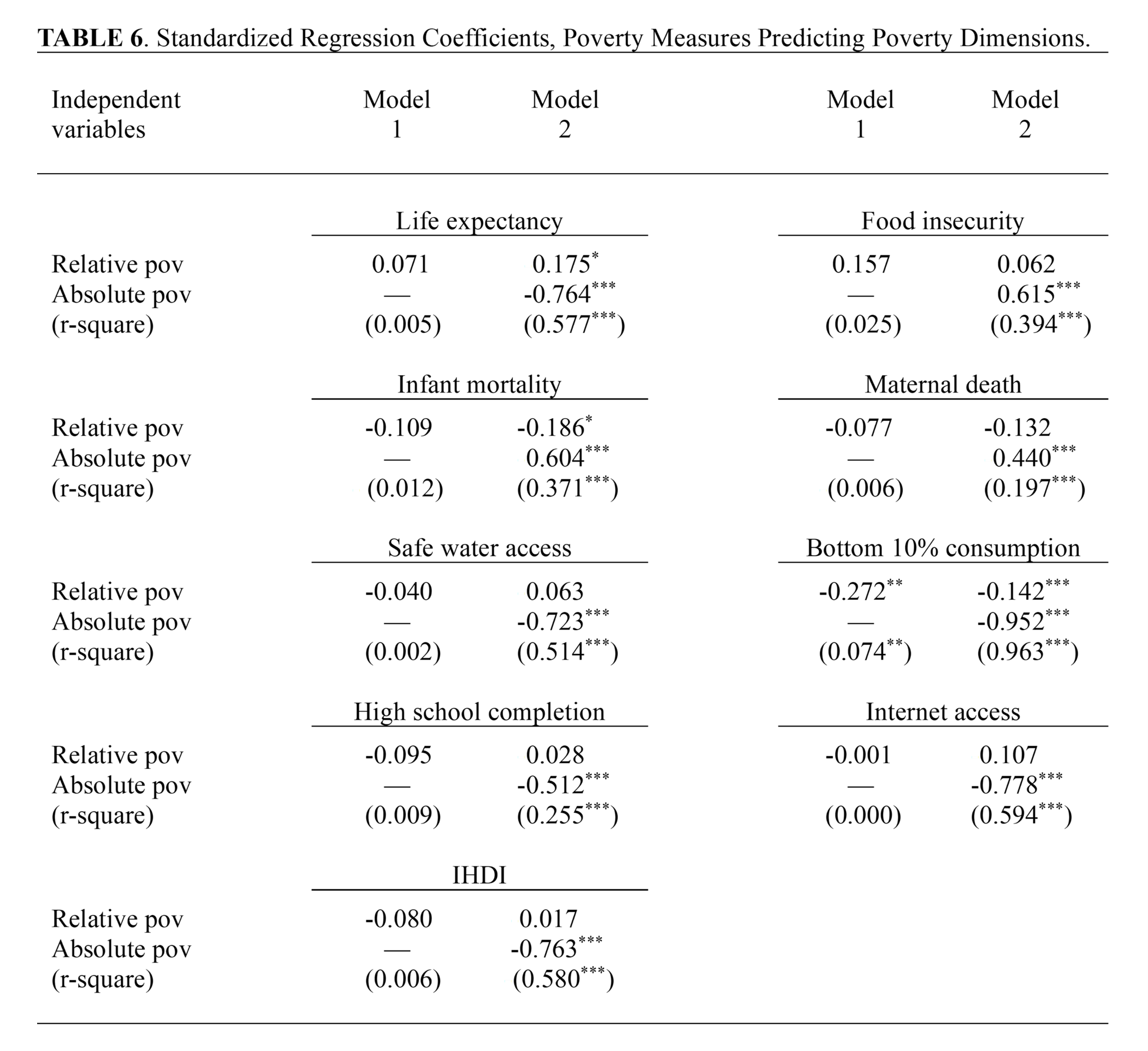
We calculated linear regression models for each poverty dimension—with both poverty measures as independent variables in the models and the poverty dimensions as the dependent variable (see Table 6 below). For each poverty dimension there are two models—one with relative poverty alone, and a second with absolute poverty added. This of course allows us to see the relative contribution of each independent variable in predicting the poverty dimensions. But it also demonstrates how much of the variance in the dependent variable (r-square value) is explained by relative poverty alone (Model 1) and then how much is added once absolute poverty is included (Model 2).
The only Model 1 that was statistically significant was for bottom 10% consumption. The standardized coefficient for relative poverty alone was -0.272**, explaining only 7% of the variance in the dependent variable. In Model 2 the r-square increased significantly, explaining 96% of the variance. In Model 2 the standardized coefficient for relative poverty decreased to -0.142***, while the standardized coefficient for absolute poverty was -0.952*** (see Table 6 below).
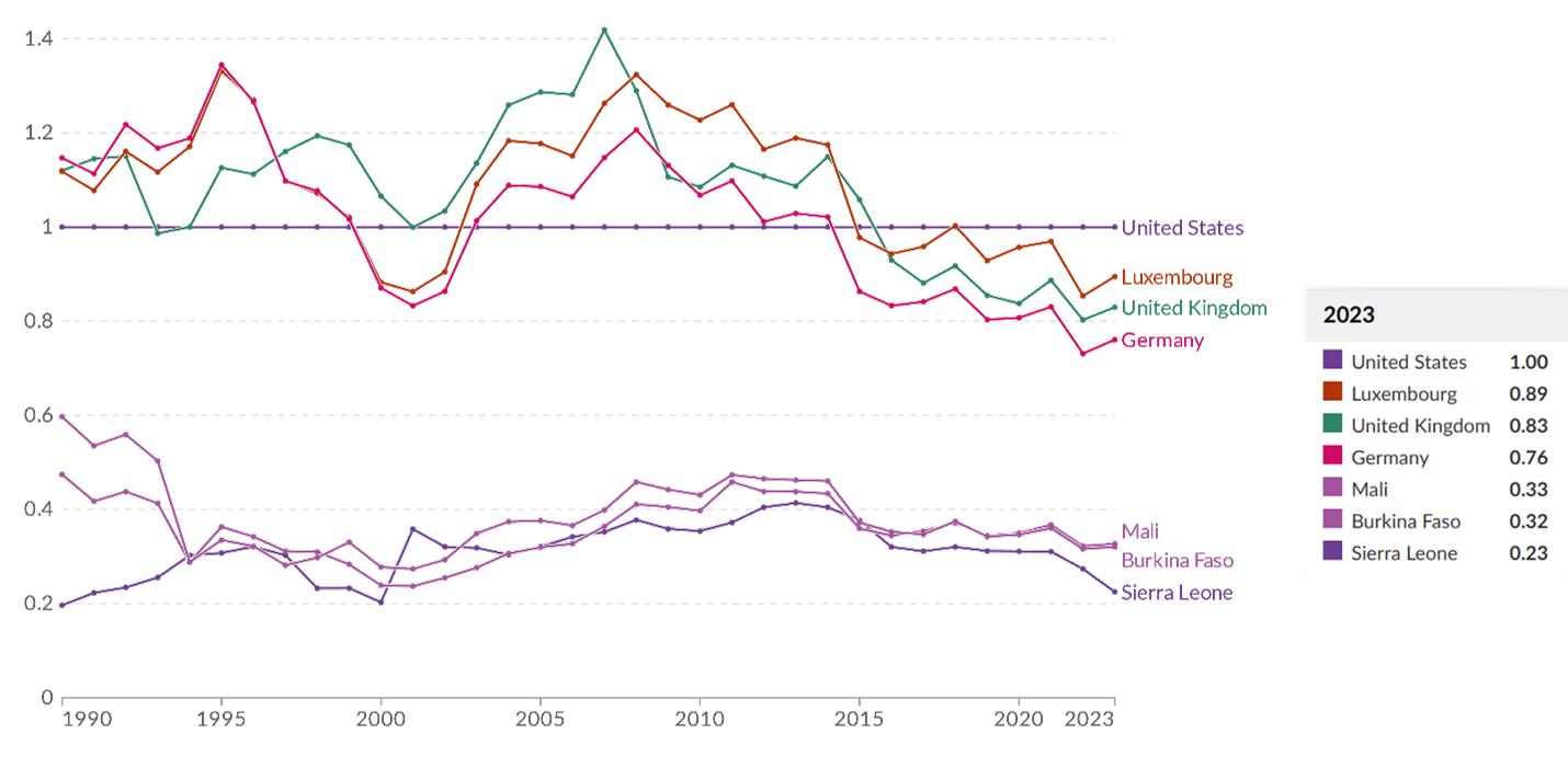
Interestingly, the bottom 10% in the U.S. have more to spend per capita per day than most countries in the world, with only sixteen countries outperforming the U.S. ($22.93/day) (see Figure 16 below). In fact, the poor in the U.S. have more to spend than the poor in most OECD countries. Additionally, the bottom 10% in the U.S. have more to spend per day than the top 10% have to spend in 42 countries for which we have data.
Like the bottom 10% consumption regression models (r-square change from 7% in Model 1 to 96% in Model 2), there were large increases in r-square values in the rest of the models as well (from <1% to 58%, 3% to 39%, 1% to 37%, <1% to 20%, <1% to 51%, <1% to 26%, <1% to 59%, and <1% to 58%). Absolute poverty had a much larger standardized coefficient than relative poverty in each Model 2, and relative poverty was not statistically significant in six out of nine of these second models (see Table 6).
Just Wealthy Countries?
Some scholars may counter this analysis by arguing that the relative poverty measure is useful as long as it is only applied to wealthy countries, while the absolute measure is appropriate to use when comparing poor countries.
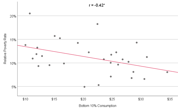
The pattern in our analyses does not change, however, when we restrict the comparisons to only wealthy countries (see Table 7 & Figure 17 below).
Take a look at Table 7 below. In this table, we recalculated our regression analyses, but this time only with the 30 wealthiest OECD countries, excluding the lowest GDP per capita countries.
In all of these models, the r-square value increased from Model 1 (where only relative poverty was an independent variable) to Model 2 (both relative poverty and absolute poverty included). And in all of the models, absolute poverty was a stronger predictor of the dependent variable than relative poverty.
The dependent variables high school completion, infant mortality, and maternal death did not return statistically significant models, so we are focusing our discussion on the six statistically significant dependent variables.
In most cases in Table 7 (below), the difference in coefficients was rather large.
For life expectancy, for instance, relative poverty was not statistically significant while the absolute poverty standardized coefficient was -0.693***. The same large differences existed for internet access (not significant versus -0.771***), safe water access (not significant versus -0.471*), bottom 10% consumption (-0.265*** versus -0.882***), and food insecurity (not significant versus 0.371*). A difference for IHDI was present but smaller (-0.445*** versus -0.680***).
Relative Poverty and Economic Inequality
Supporters of the relative poverty measure have made several arguments in its favor, including that it measures poverty as it is culturally understood in a particular place and time. They argue that a poverty measure should capture what it means to be poor to people in a particular culture at a particular moment in time. Being poor might mean going hungry in one culture, for instance, while in another culture the poor are well-fed and higher-order needs like the ability to afford childcare delineate the poor from the nonpoor.
By this logic, relative poverty measures are not so much measuring poverty (at least as it is generally understood by many) but economic inequality, social exclusion, capability deprivation, social isolation, marginalization, or something else. It is fine to measure those things, but it would then be much more appropriate in our view to make the argument that directly refers to what you are measuring. Using imperfectly aligned terms like “relative poverty” seems to obfuscate the analysis. If you are measuring social exclusion, call it that.
Divorcing the meaning of “poverty” from what many people understand it as—lacking the means to afford one’s basic material needs—is unnecessary in our view. We already have a vocabulary to describe the relative difference between income groups in a society: economic inequality. We already have appropriate measures for this as well, like the Gini coefficient and Palma ratio.

To test the relationship between relative poverty and poverty dimensions after controlling for income inequality, a series of hierarchical linear regressions were conducted. The hierarchical linear regressions were conducted by regressing a measure of income inequality, post-tax Gini coefficient values, and relative poverty onto poverty dimensions. Post-tax Gini coefficients were entered into the first block and relative poverty was added in the second block. Results indicated that, after controlling for income inequality, relative poverty provides no additional predictive contribution. These results are displayed in Table 8 below.
It is important to note that, while not displayed in Table 8, this pattern of results holds if Palma ratio values are used as a substitute for post-tax Gini coefficients as a measure of income inequality.
FIG 16. Bottom 10% Consumption Per Capita Per Day (countries 1-50).

FIG 16 (continued). Bottom 10% Consumption Per Capita Per Day (countries 51-91).
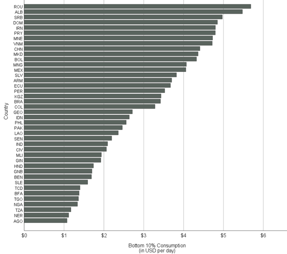
FIG 17. Association Between Poverty Measures and Bottom 10% Consumption, Wealthiest OECD Countries.


To test the relationship between absolute poverty and poverty dimensions after controlling for income inequality, another series of hierarchical linear regressions were conducted. The hierarchical linear regressions were conducted by regressing the measure of income inequality, post-tax Gini coefficient values, and absolute poverty onto poverty dimensions. Post-tax Gini coefficients were entered into the first block and absolute poverty was added in the second block. Results indicated that after controlling for income inequality, absolute poverty provided additional predictive value of most poverty dimensions above and beyond that of income inequality. These results are displayed in Table 9 above.
These results suggest that absolute poverty is a distinct predictor of poverty dimensions. There is one notable exception to this pattern in that high school completion is not predicted by absolute poverty over that of income inequality as measured by post-tax Gini coefficients. It is important to note that, while not displayed in Table 9, this pattern of results holds if Palma ratio values are used as a substitute for post-tax Gini coefficients as a measure of income inequality.
For additional insights, refer to both Table 3 (bivariate correlations) and Appendix Table 3 (additional regression analyses), which demonstrate how much more strongly relative poverty is associated with Gini coefficients and Palma ratios than absolute poverty.
Summary
The earnings of the American poor fared well when compared with the rest of the world. Compared with a subset of the 30 wealthiest OECD countries, the U.S. absolute poverty rate was in the middle of the pack.
We also find that absolute poverty is a much better predictor of poverty dimensions than relative poverty. Since relative poverty does not measure the condition of poverty as it is generally understood by most people, we believe it inappropriate to use this measure to study poverty.
Finally, we find that (a) relative poverty appears to be measuring economic inequality instead of poverty and (b) other established measures, like the Gini coefficient and Palma ratio, seem to be better measures of economic inequality than relative poverty.
For the study’s appendix and reference list, click here.
Author Bios
Lawrence M. Eppard is an associate professor of sociology and director of the Connors Institute for Nonpartisan Research & Civic Engagement at Shippensburg University.
David A. Boatwright is a Connors Institute research fellow and an undergraduate student at Shippensburg University.
Thomas C. Hatvany is an associate professor of psychology at Shippensburg University and supervises the Connors Institute’s Democracy Lab.
Stock image from unsplash.com
ENDNOTES
Earning less than 50% of the national median income in one’s country.
New Zealand did not have data, reducing our OECD dataset from 38 to 37.
Having less than $30/day in USD to spend.